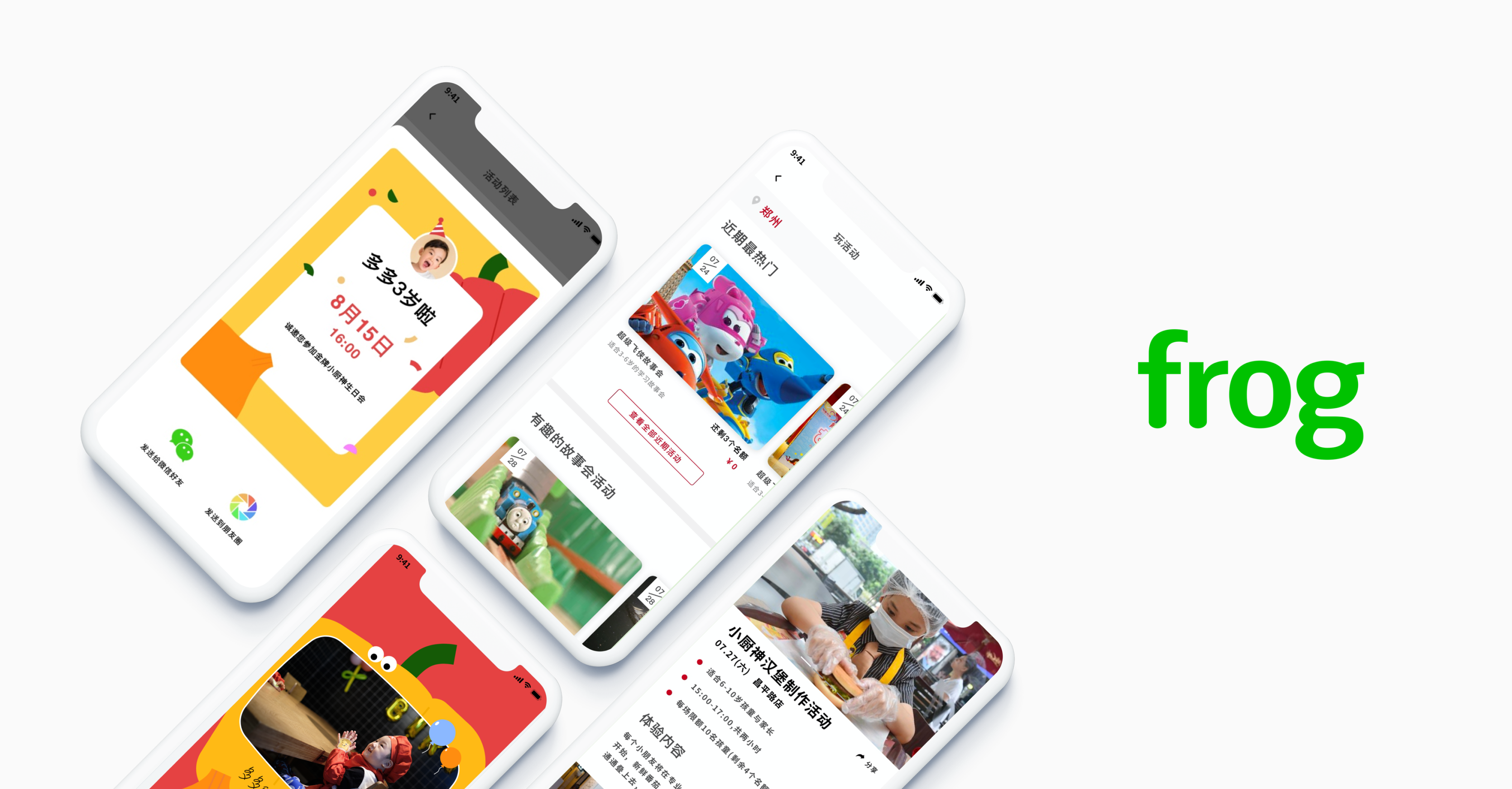
Dexcom Go: easing the device setup journey for diabetes patients
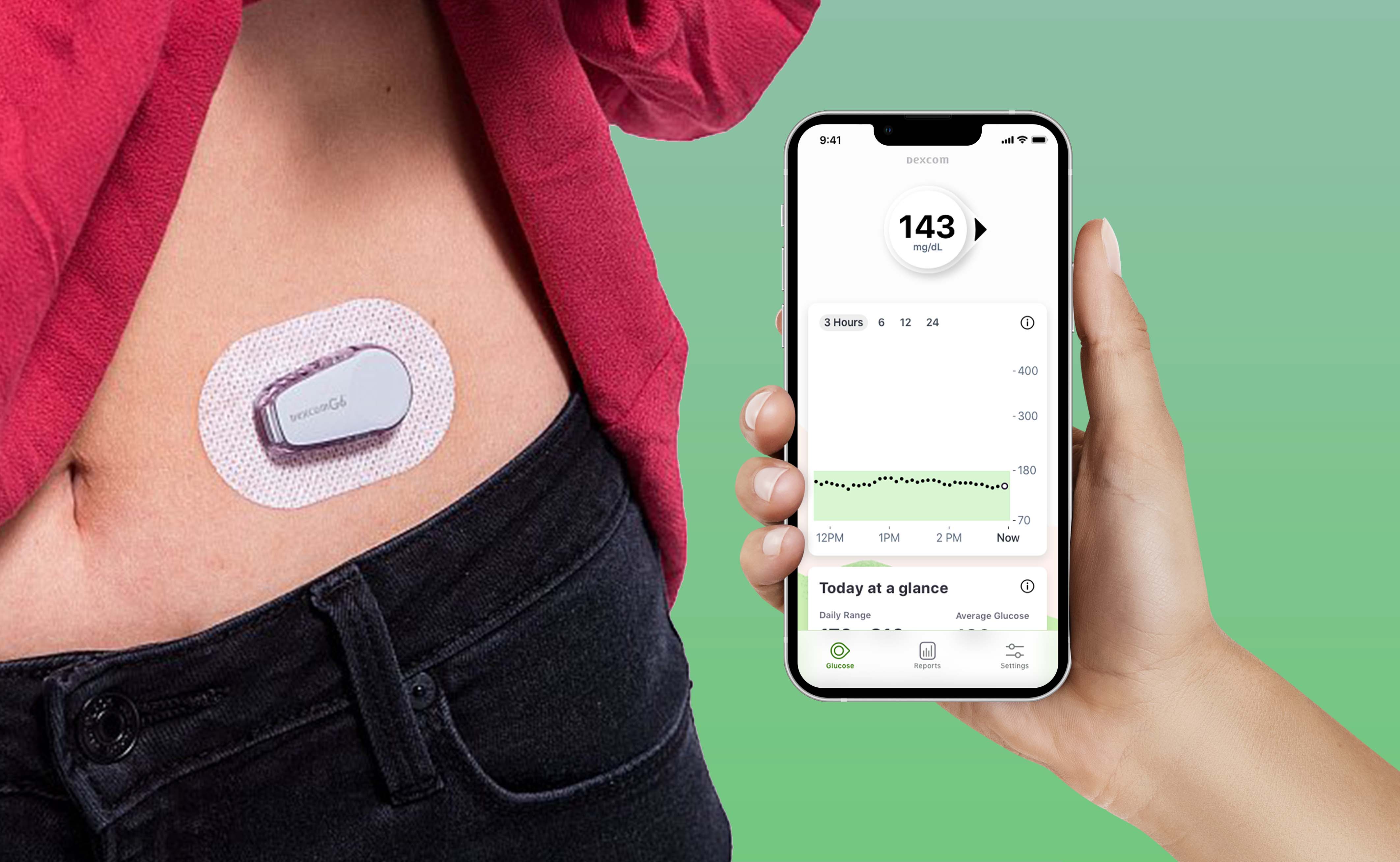
Dexcom is a continuous glucose monitoring top 1 product in the diabetes markets. Dexcom GO opens the market for T2 diabetes consumers over the counter and turns into a lifestyle app .
Outcome
Turning a failed onboarding flow into a simple device setup experience
I successfully shipped 3 designs prints including onboarding, settings, and glucose monitoring for final round human factor testings. Now the app is still under development but we helped largely improve onboarding flow that was tested well across multiple RITE testings.
Key features
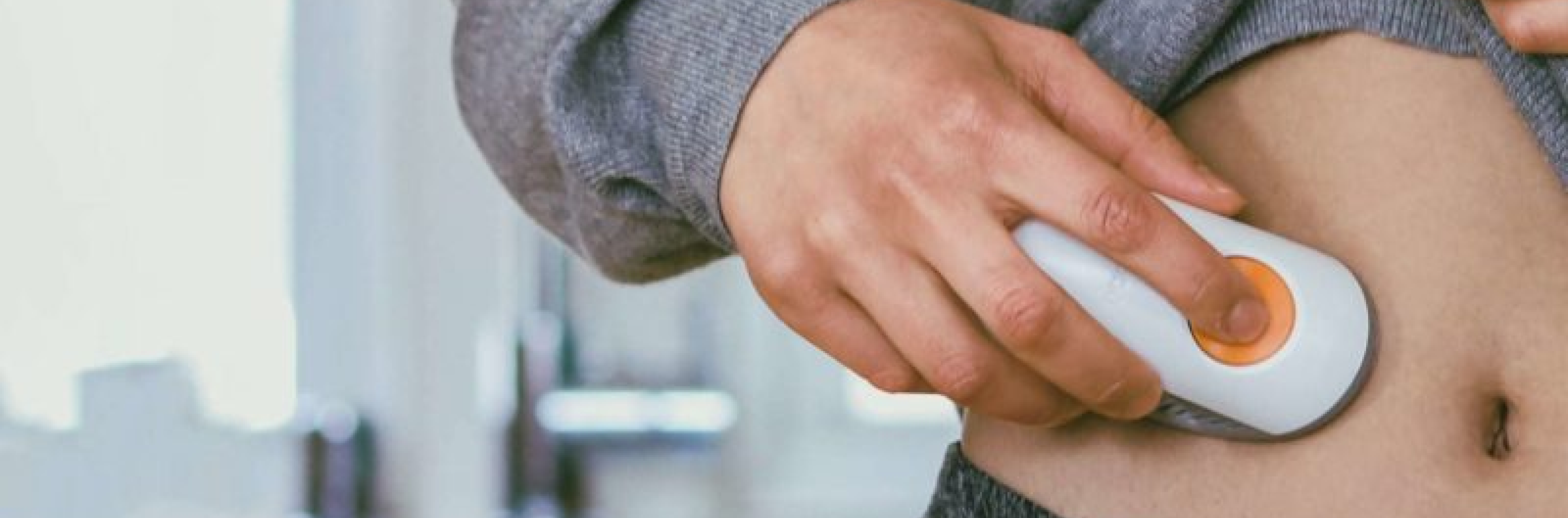
Building on existing hardware, designed for Type 2 needs
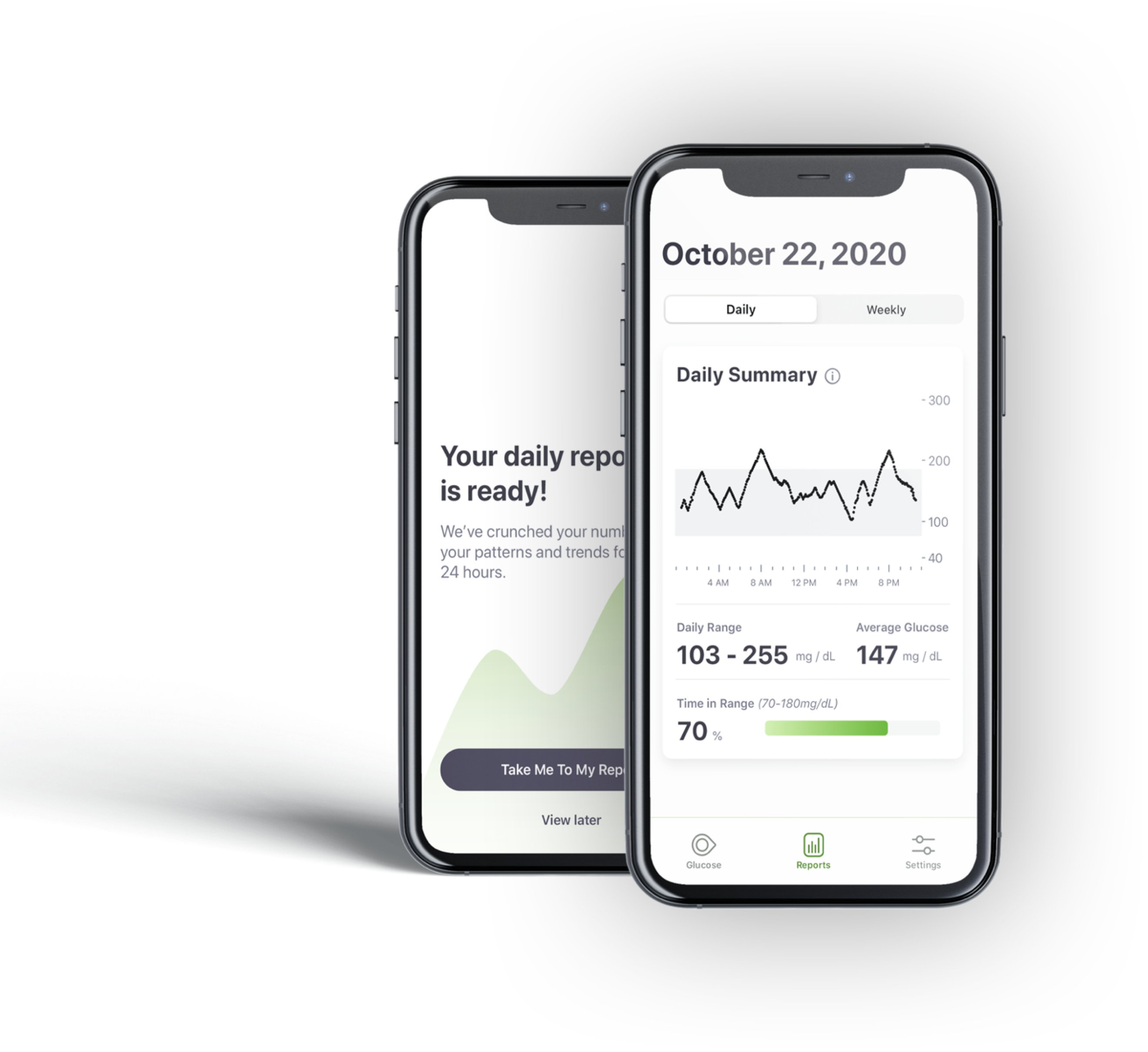
Daily report
Daily summary graphs allows patients to see when they are in range and when during the day highs and lows occur by providing simple information
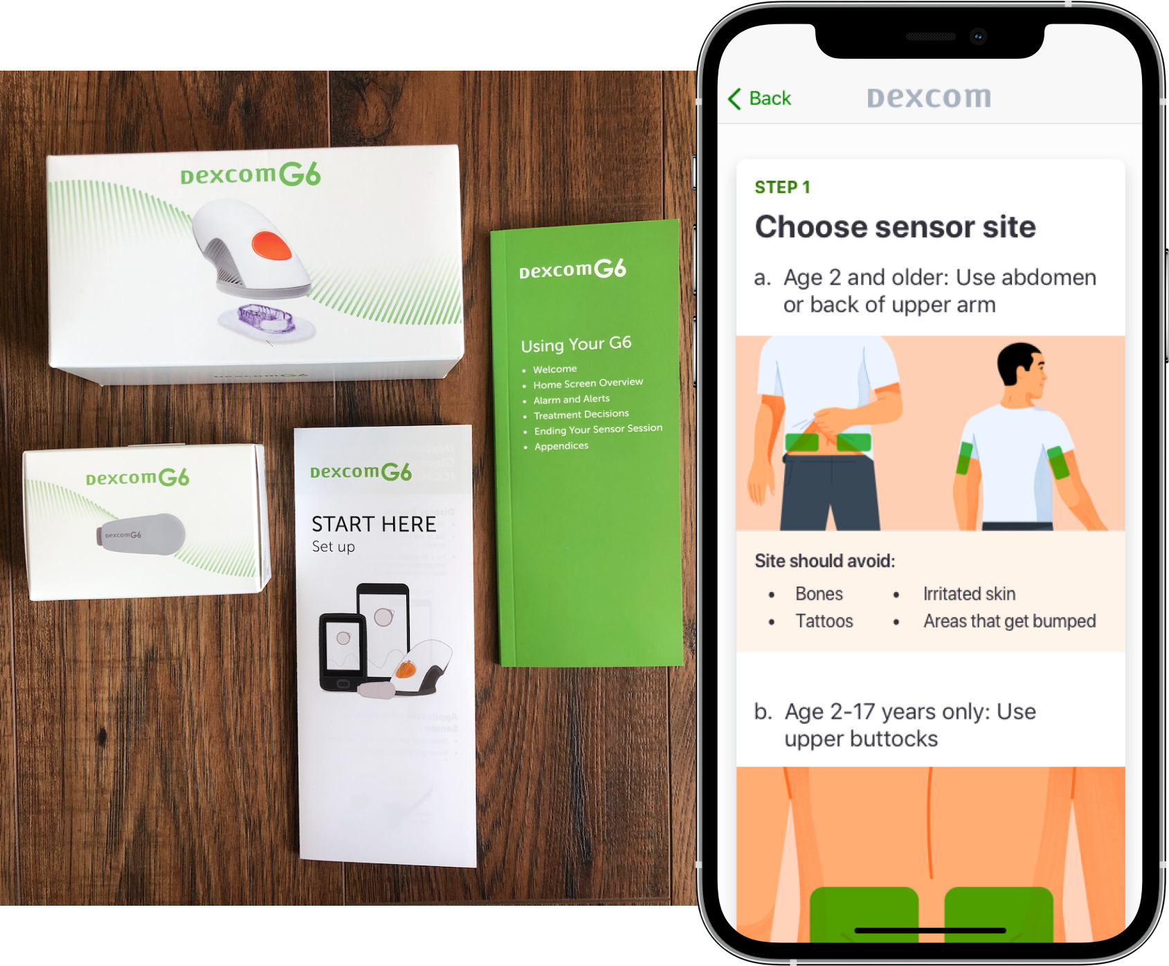
Clear onboarding
Introduces core ideas of CGM Set up one device at one time
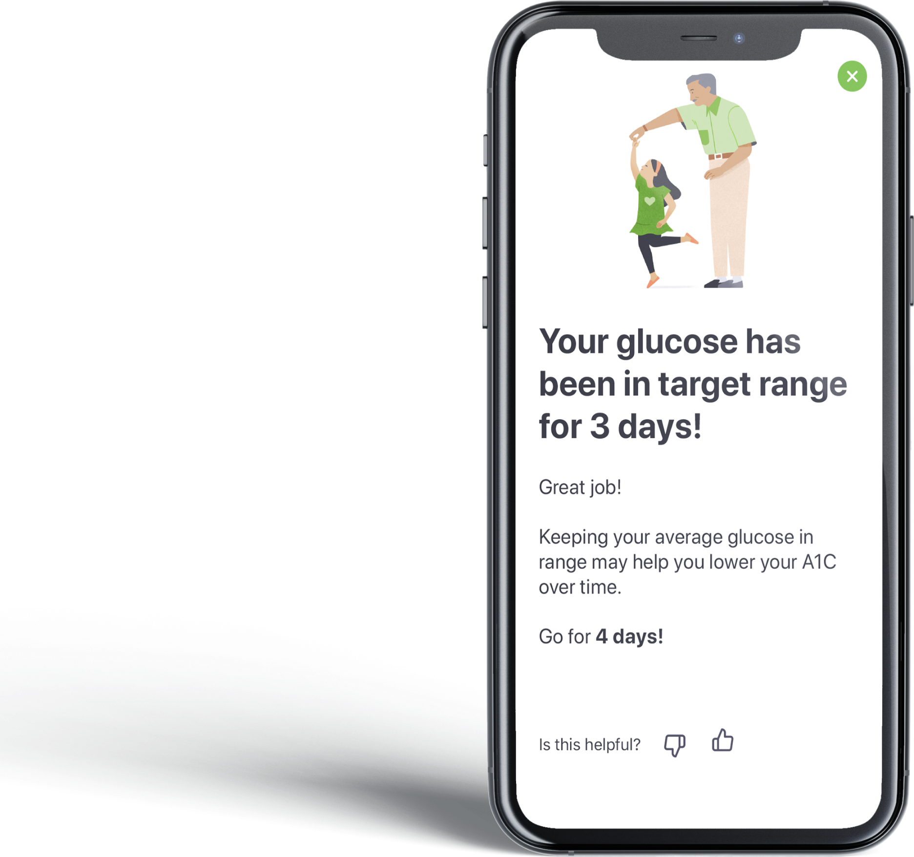
Motivating insights
Feedback mechanisms help users tailor future insights to those most personally relevant.
Objective
How can we ease the setup onboarding flow for first time T2 users who are CGM naive?
Problem
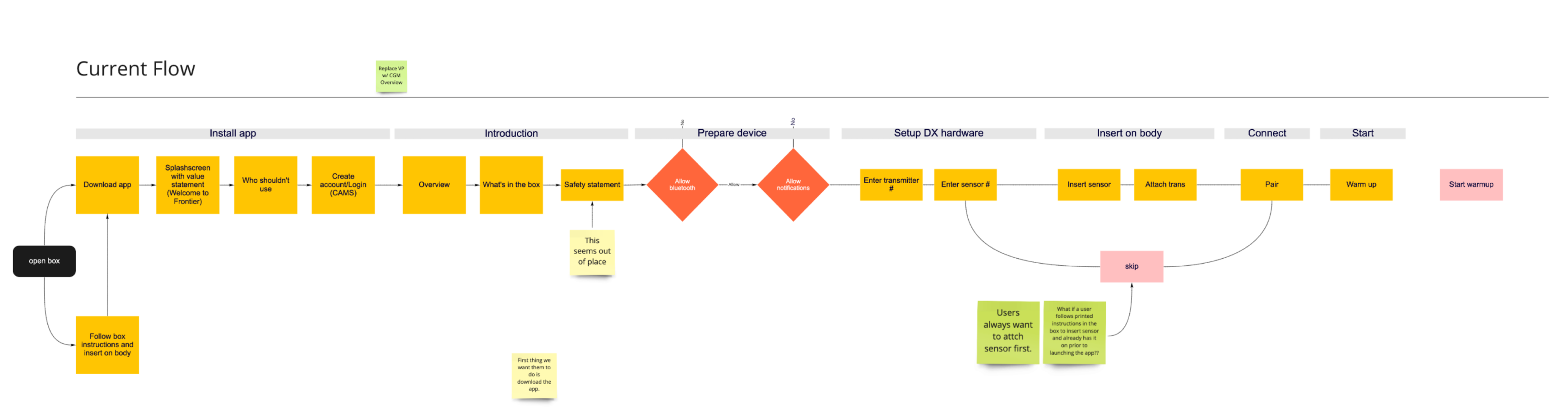
10/10 failed to finish onboarding flow because users are more impatient than we expected when it comes to apply a wearable to their body
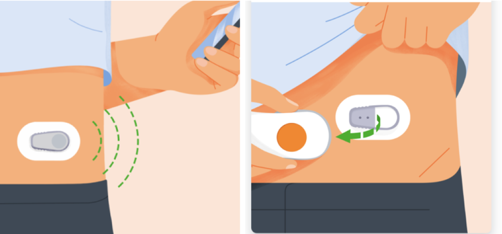
Illustration & Content Misleading
Users are not able to distinguish which is applicator, sensor and transmitter
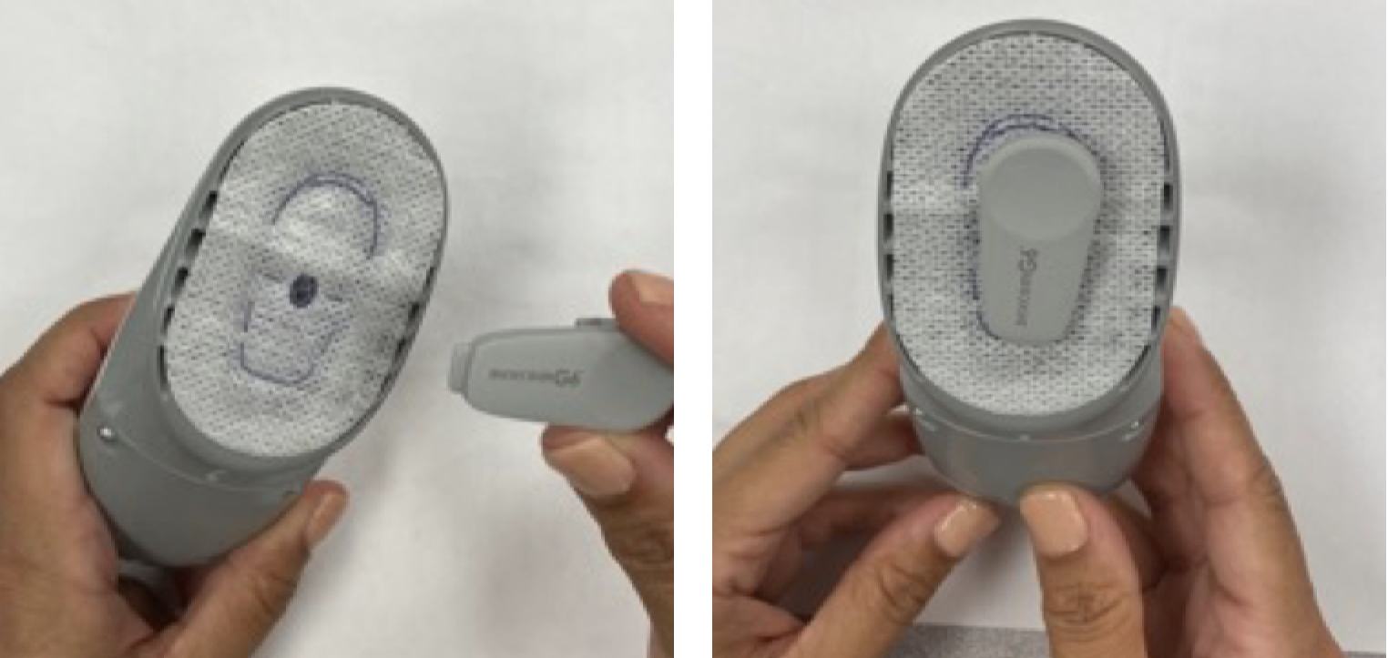
Physical hints overwrites instructions
Type 2 users can hardly understand CGM insertion works since they are not born with diabetes
Insight
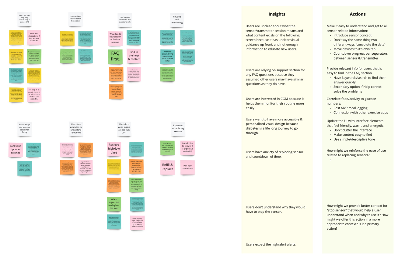
Too much cognitive load leading to disconnection from scanning to applying to their body
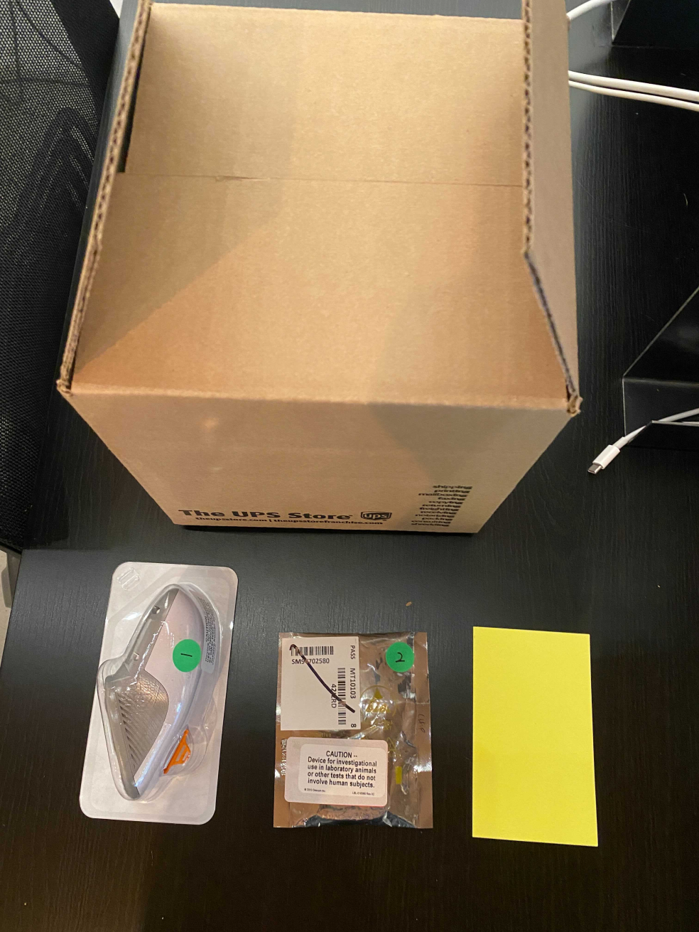
Prepare device was the key part of the flow but 6/6 users were unclear which to apply to their body after unpacking box packages.
Guerrilla testing
A way to reach a 75% insertion success rate
Type 2 users are having no ideas about CGM device and they are not born with Diabetes. It is hard for them to have a mental modal of inserting a sensor into their body.
6 / 8
users successfully inserted the sensor and transmitter
Approved
by internal teams and sent to formative testing
Round 1
Labeled packages and a bulleted, actionable to-do list
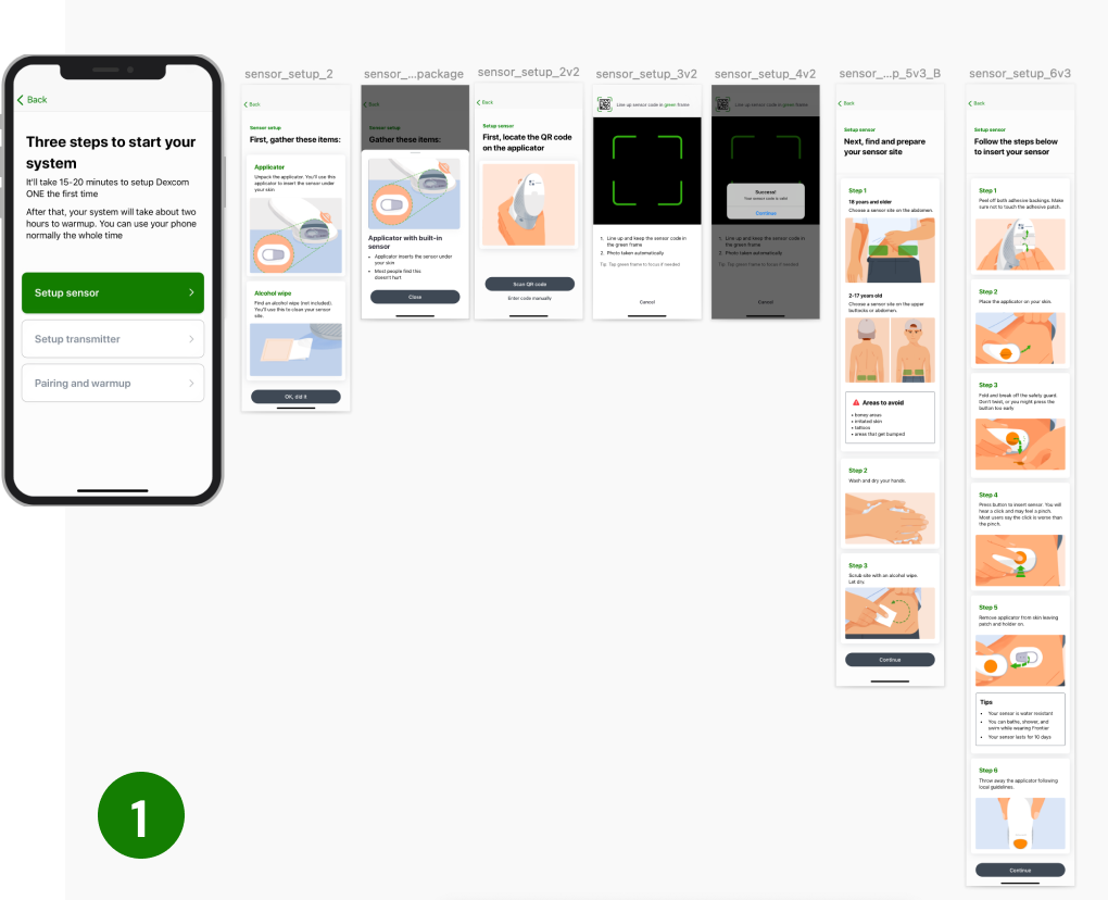
Previously design was setting up the devices together, but users are not clear which one to apply to their body. They are not sure the differences between each package.
Change 1
Added 1.2.3 labels to each package
Change 2
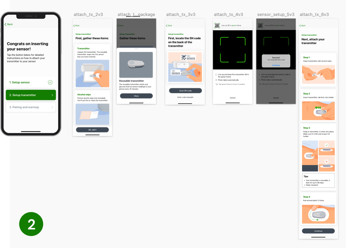
Split the sensor & transmitter flow into multiple steps
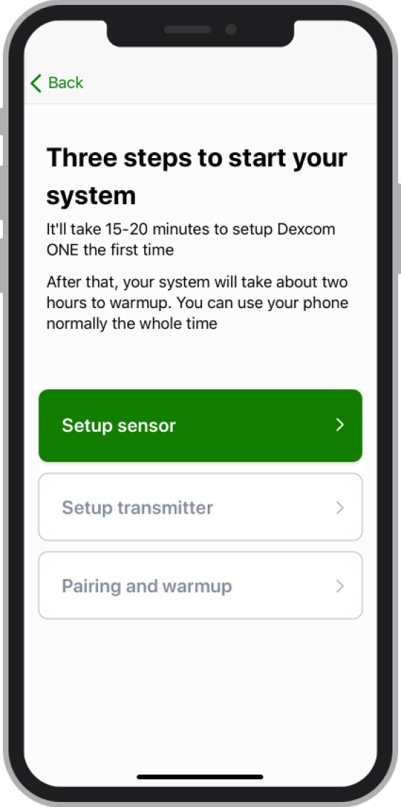
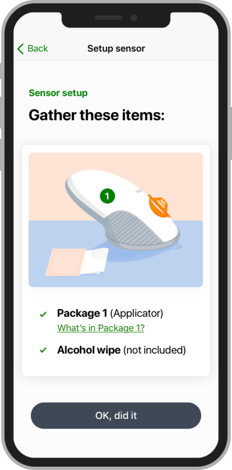
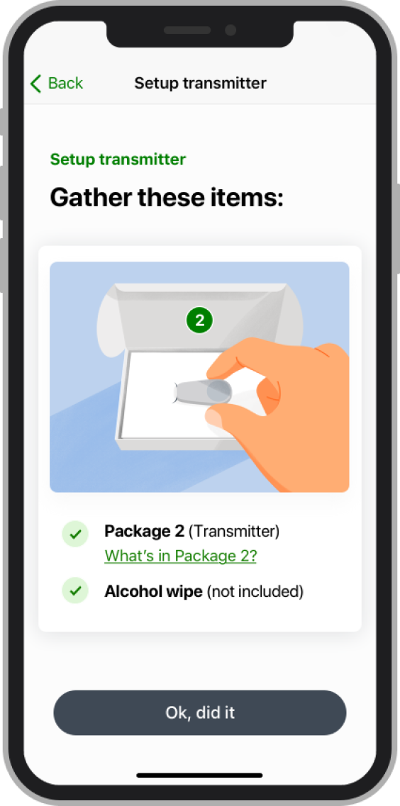
Split the mental model of the 2-device setup flow
Compared to Dexcom original design that users have to unpack both boxes and then apply to their body. We made a flow wide change: before users unpack each box, we require them to finish setting up one device at a time.
Before
After
Constraint
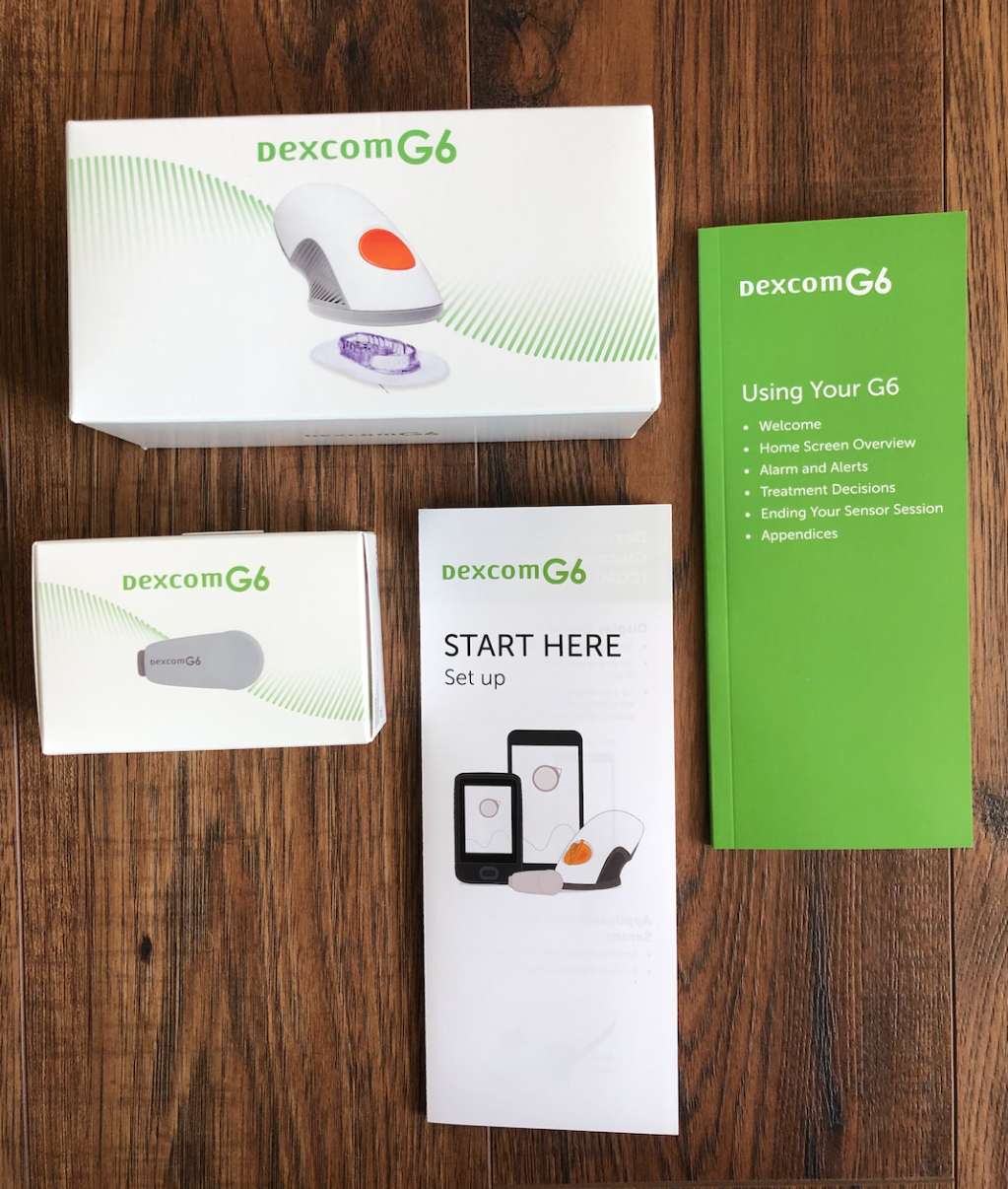
Starter kits come with 2 devices together, but people may get it from OTC products, that labeling may not work for single packages.
Round 2
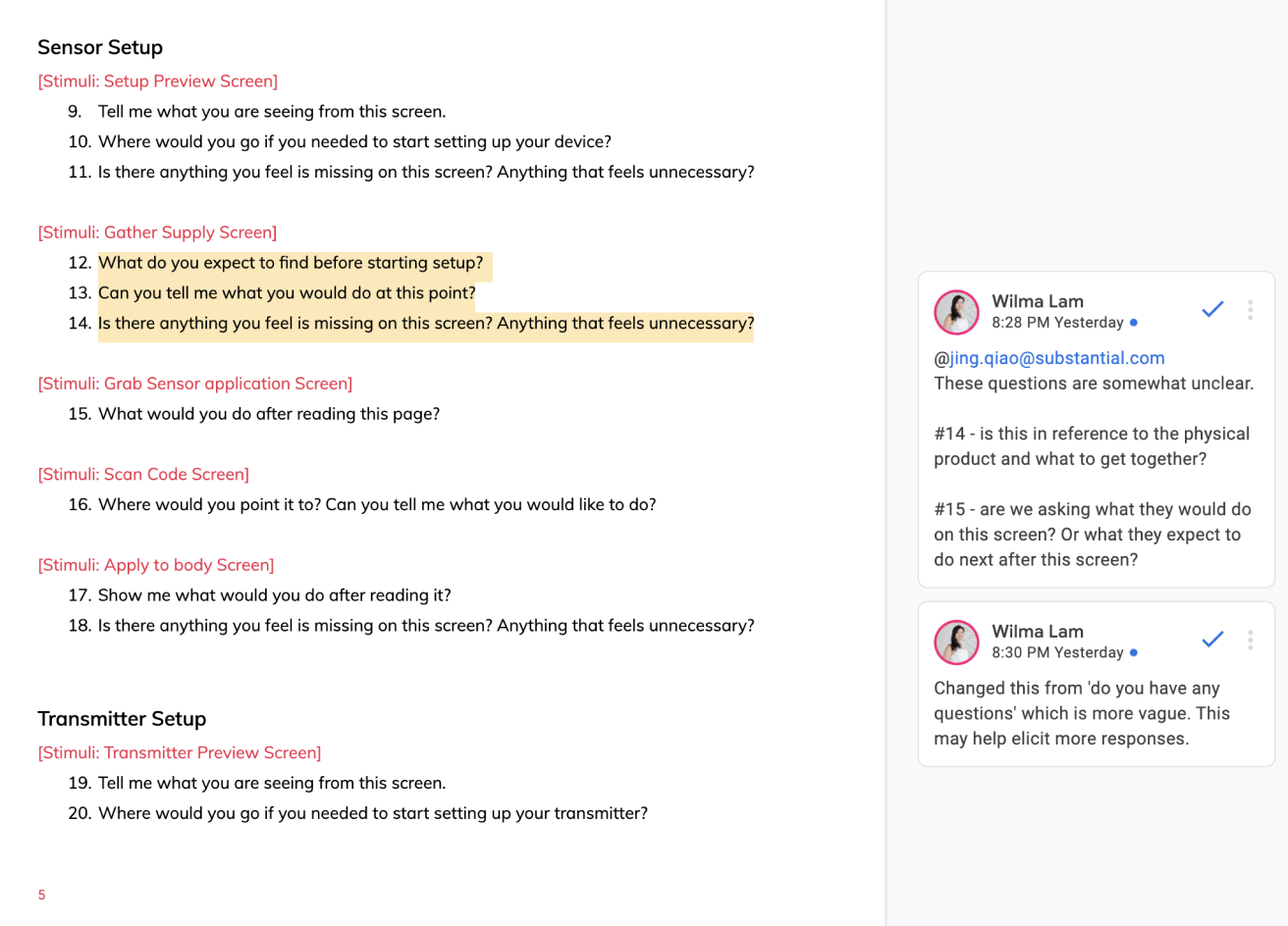
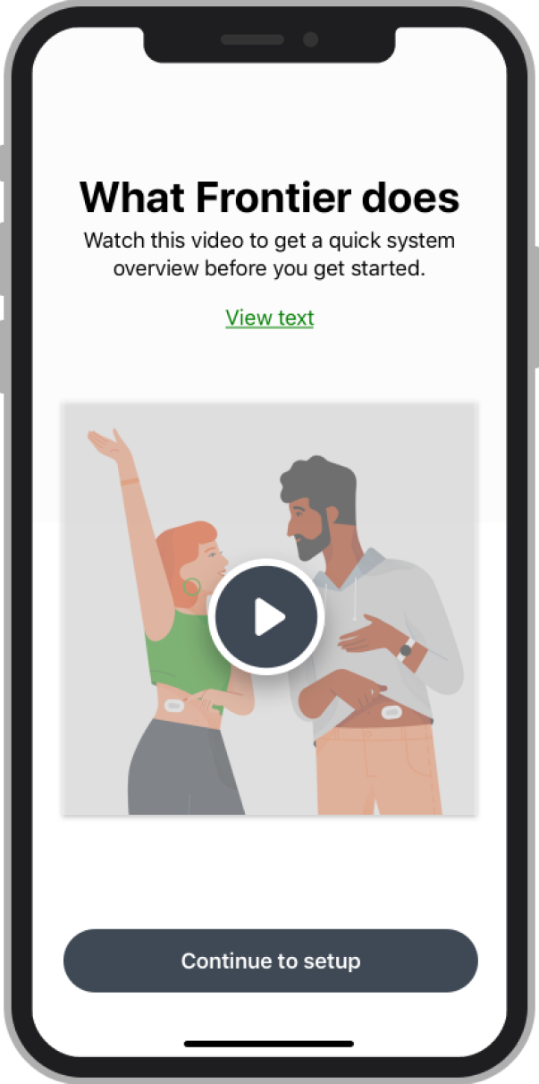
Removed labels, updated package illustrations and added a video demo
We decided to test the real package by building up mental model ahead with video preview that we made directly from the exiting Dexcom tutorials so that they can just voice over it again later. This gives user an overview before starting all the detail setups.
Participant
" But I just think if you're giving space to make a picture and words, it could be more clear, even when they're saying rub your finger like this.” -Type 2 Diabetes patient
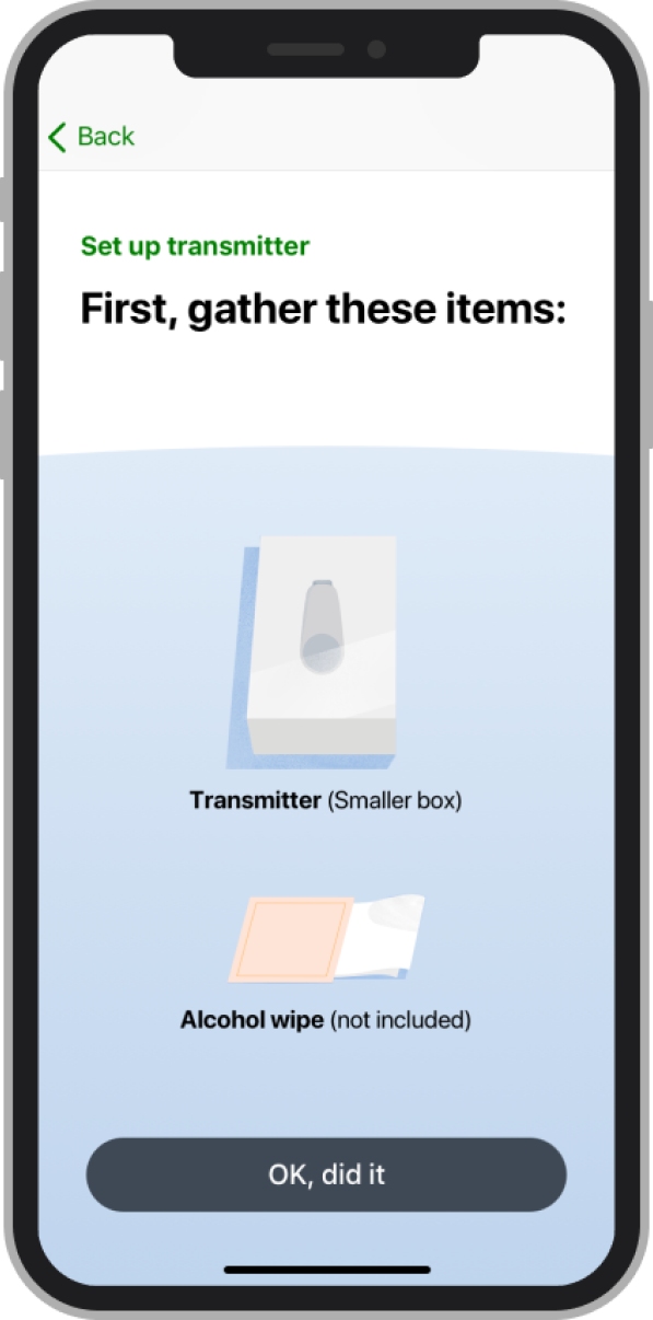
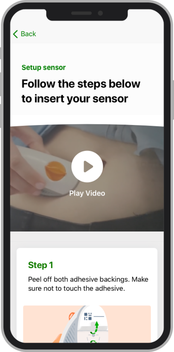
Iteration
Instructional design to improve cognitive learning
We shared design to our internal team and gain main stakeholder feedbacks. I also decided to make a holistic change across every call to the action illustrations to help users to align with the users actions at that moment.
Before
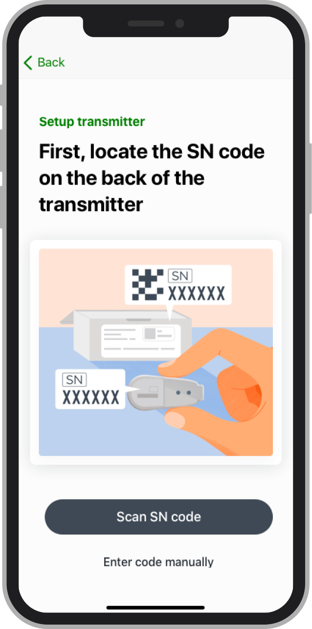
After
Before
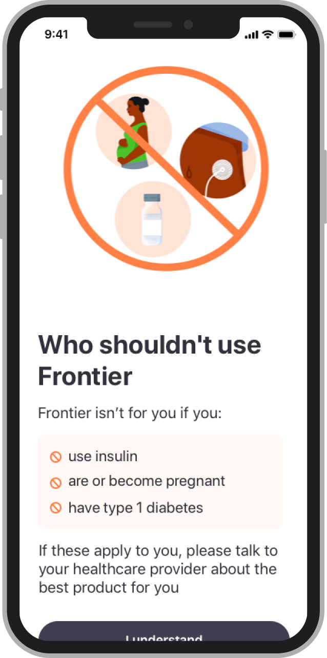
After
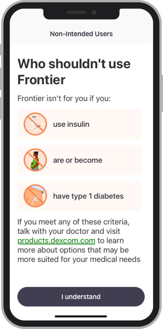
Before
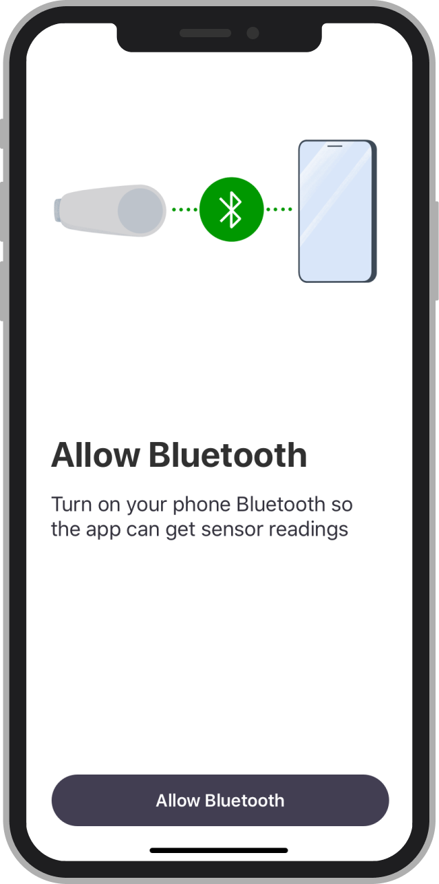
After
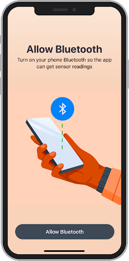
Adding Visual Iterations from too much visual distractions into focus area of objects.
Working with developers
Design system
1. iOS Development team implemented data graph components during the Sprint 1 2. Edge cases (out of range zone) are reviewed and developed